The Daily Roxette presents ROX40
★ Monthly Mock-Ups! ★ July ★
We have a special guest designer for July’s Monthly Mock-Up, and it’s a goodie!
We haven’t really done guest spots on the Monthly Mock-Up feature, however, I was sent this and it was too good not to share!
Designed and kindly shared by the very talented, Florian Frandl… We’ll handover to him now.
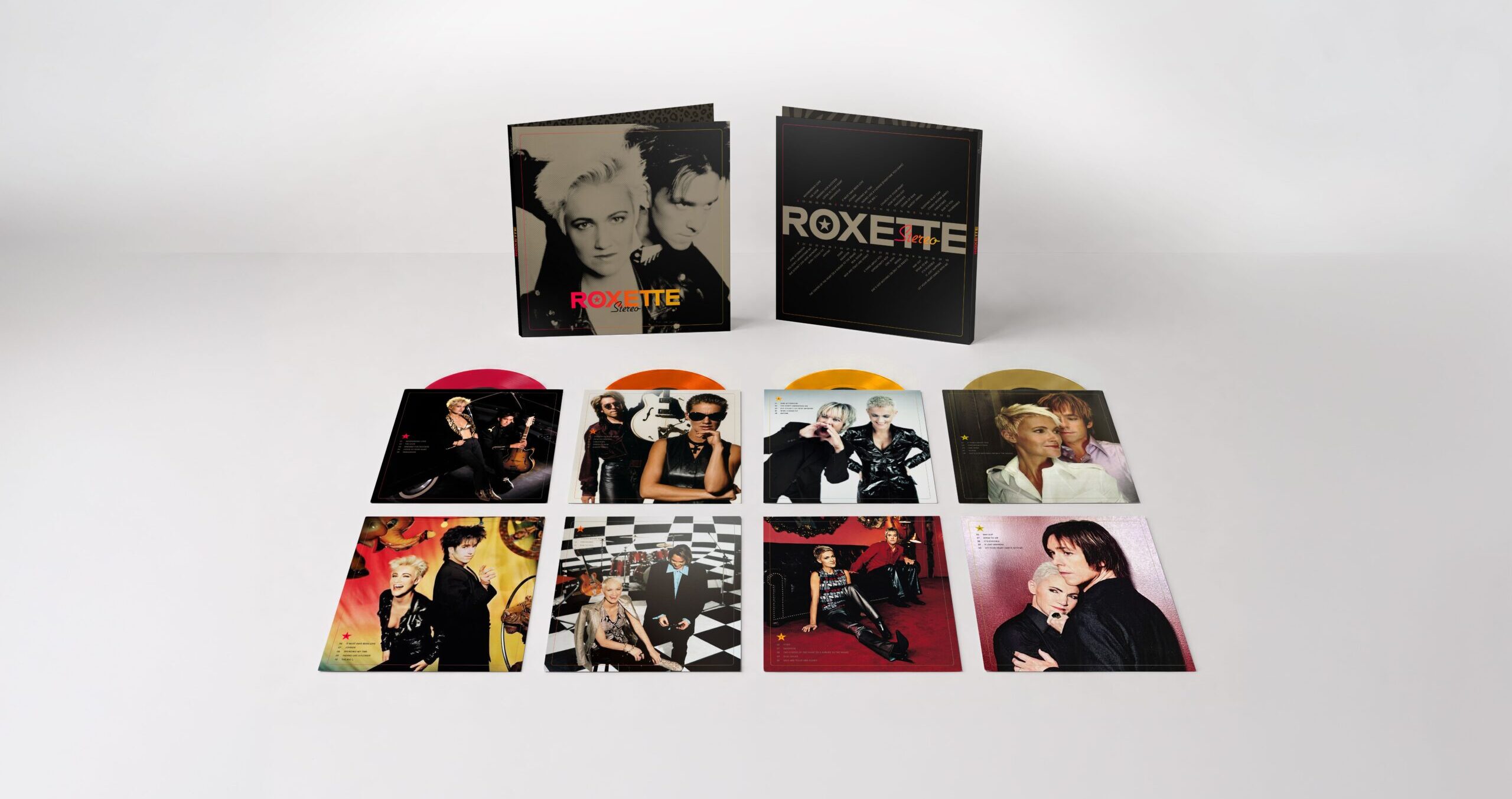
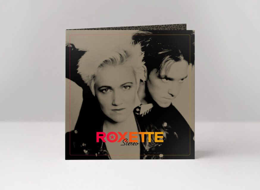
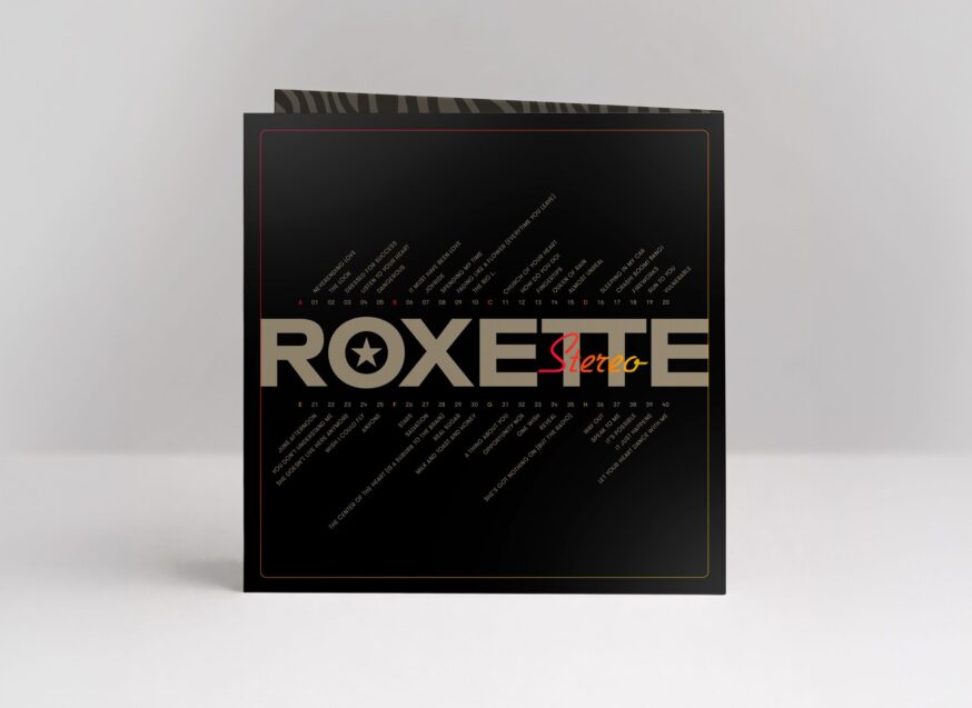
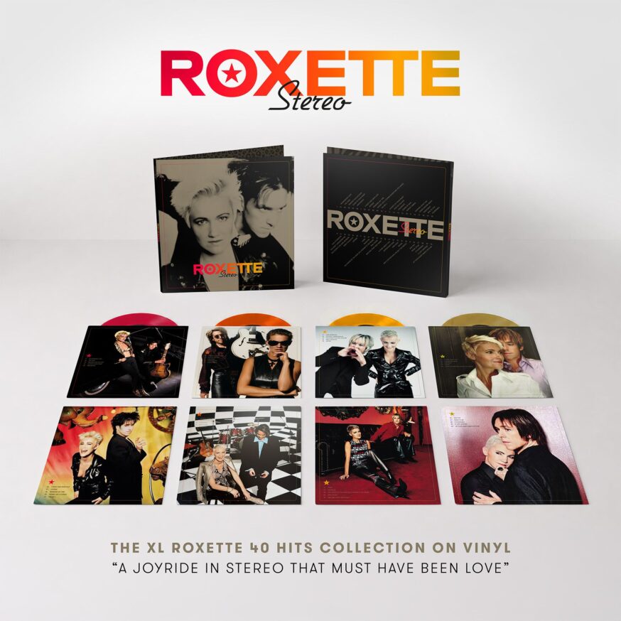
ROXETTE ★ STEREO
THE IDEA
“Stereo” is a concept for an XL greatest hits vinyl collection celebrating Roxette’s 40th Anniversary. Featuring all 40 official singles across four coloured vinyl records, “Stereo” is conceived as the definitive retrospective of one of pop music’s most successful and beloved acts.
Created as a Collector’s Edition for long-time fans and a gateway for new audiences, the project brings together four decades of music, imagery and visual identity in a single, cohesive collector’s experience.
THE COLLECTION
Since 1986, Roxette’s catalogue has produced countless international hits and multiple visual eras. While several compilations have been released throughout the years, there is currently no single vinyl collection that presents all official singles in one unified and contemporary format.
“Stereo” aims to fill that gap. The concept combines collectability, storytelling and premium vinyl culture into a product designed for today’s audience while respecting Roxette’s legacy.
THE WHY
Few bands have left a mark on popular music quite like Roxette.
For nearly four decades, their songs have accompanied first loves, heartbreaks, road trips, celebrations and everyday moments for millions of people around the world. Their music continues to transcend generations, languages and borders, becoming part of countless personal soundtracks.
A legacy of this significance deserves more than a retrospective. It deserves a thoughtfully crafted collector’s edition that celebrates not only the music, but also the visual legacy, memories and emotions connected to it. “Stereo” was created as a tribute to that enduring connection.
THE TITLE
“Stereo” is more than a title — it is a reflection of what made Roxette unique.
Like the left and right channels of a stereo system, Marie Fredriksson and Per Gessle brought together two distinct personalities, voices and creative forces.
The title also pays tribute to the golden era of vinyl records, hi-fi systems and immersive listening experiences in which Roxette became a global phenomenon. At the same time, “Stereo” echoes the duality that defines great pop music: strength and vulnerability, melancholy and joy, intimacy and spectacle.
Two artists. Two channels. One timeless sound. Between the left and right channels lies the sweet spot. For millions of listeners around the world, Roxette has been exactly that place for many decades.
THE DESIGN
The visual concept draws inspiration from the many artwork eras that shaped Roxette’s career.
As Roxette’s logo evolved from album to album, a custom wordmark was created specifically for this XL collection. It retains iconic elements of the band’s visual identity — the star within the “O” and the distinctive double “TT” merged into a single graphic form — while the all-caps lettering gives the ROXETTE name a bold and confident presence. The title “Stereo” is set in the same script typeface that appeared on “The Heartland Café”, sometimes regarded as Roxette’s unofficial debut album — a subtle reference that dedicated fans may recognise.
The selected photographs represent different eras of the band’s style, image and evolution. Presented without excessive effects or filters, they allow the photography and the personalities behind the music to take centre stage.
Rather than recreating one specific period, “Stereo” combines references from across Roxette’s entire catalogue into a visual language that feels both familiar and timeless.
Every design decision was guided by one objective: to create a product that feels as though it has always belonged in the Roxette catalogue.
THE FEATURES
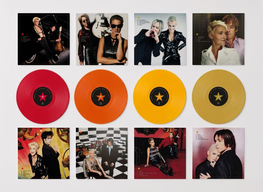
★ 40 official singles across four coloured vinyl records
★ Premium gatefold edition with custom-designed inner sleeves
★ Visual journey through four decades of Roxette imagery
★ Created for collectors, fans and a new generation of listeners
FRONT COVER
A rare and iconic photograph of Roxette in gold and black, combined with bold typography and the band’s signature colour palette of reds and yellows.
BACK COVER
The 40 tracks across four LPs are arranged in a creative and intuitive “stereo layout”, inspired by the frequency scales and visual language of classic FM radio tuners.
INNER SLEEVES & VINYLS
Each inner sleeve features 2 iconic photographs from a specific Roxette era. Colour-coded stars create a visual connection between the sleeves and their corresponding vinyl records, helping to guide the listener through the collection.
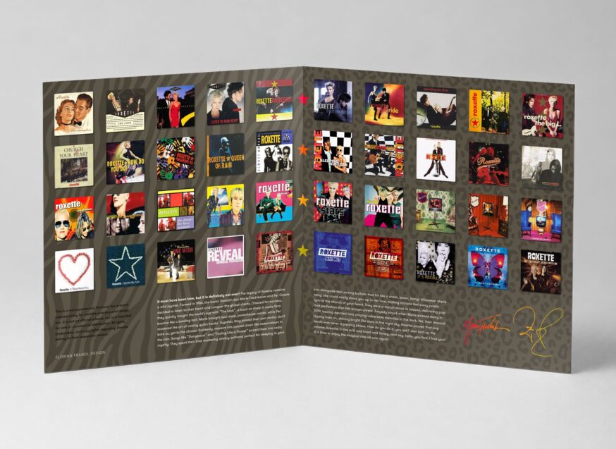
GATEFOLD
The gatefold interior showcases the artwork of all Roxette single covers, arranged across a bold animal-print backdrop. It also features a concise band biography, carefully refined with subtle insider references and details that long-time fans will instantly recognise and appreciate.
A joyride in stereo that must have been love.
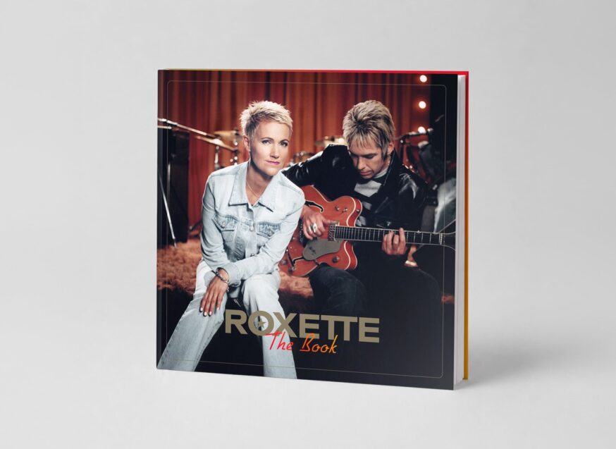
THE BOOK
ABOUT THE DESIGNER IN HIS OWN WORDS…
 My relationship with Roxette began in the summer of 89.
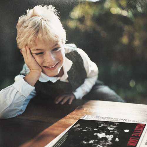
At the age of six, while other children were singing nursery rhymes, I was already singing: “Hold on tight, you know she’s a little bit dangerous” — without having the slightest idea what it meant. Around the same time, I borrowed my cousin’s copy of Look Sharp! — and never returned it.
The Look Sharp!album cover became the starting point of something much bigger.
It sparked my fascination with graphic design and visual storytelling and ultimately inspired the career I have pursued ever since.
More than three decades later, “Stereo” became an opportunity to revisit the band that unknowingly set me on the path to becoming a designer. And as a passionate vinyl collector, I often found myself wishing for the one Roxette release that never existed: a complete singles collection that brought together the music, imagery and legacy of the band in a single definitive premium edition.
FLORIAN FRANDL – Art Director, Brand Designer, Photographer
 For more than 20 years, I have been creating brand identities, packaging concepts and holistic brand experiences for national and international clients.
Having studied in Austria and Australia, I gained professional experience at Mutabor Design (Hamburg) and Red Bull (Salzburg) before establishing my own independent design studio in 2015.
My work is driven by the belief that great design goes beyond aesthetics. It creates emotional connections, tells stories and gives brands a distinctive voice.
By combining strategic thinking with a passion for detail, I create visual identities that feel authentic, memorable and built to last.
“Designing for music has always represented the highest form of visual communication to me. Creating visual experiences for art that is meant to be heard is where design and emotion meet at their strongest.”
★ A big THANX to Flo for sharing his designs and story ★
All designs and accompanying text by FLORIAN FRANDL – Art Director, Brand Designer, Photographer // https://flo.at
Next Month
We’ll be back next month with another brand-new mock-up.
What could it be? Any suggestions?
|
|
July 1st, 2026
This article was posted here on TDR in these categories:
*Good Reporter article, ROX40: Monthly Mock-Up, TDR: Monthly Mock-Up, TDR:Roxette.
[tdr 1064313]